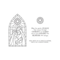
I had a chance to play this weekend with my new favourite stamp set - the Gentle Peace photopolymer stamp that came in my box on Thursday night. Can I just say - for the record - that I love it. But I definitely need your help in deciding which direction to take next.
 |
| #1 - Orange and Yellow Background |
 |
| #2 - Background with added Blues |
Now most of you know that Gentle Peace was designed to showcase our Stampin' Up! Blendabilities and I have seen some absolutely gorgeous creations on Pinterest, but this weekend I was in a colour-me-fast mood and I didn't want to take the extra time that Blendabilities would need. So I chose my favourite *fast* method of colouring...using my Aquapainters!
Don't get me wrong, Blendabilities allow you to achieve much more vibrant colours and in truth they do not take 'that' much longer in terms of time...but patience wasn't my strong suit this weekend so I opted for as fast as I could get!
Help me out here friends - first of all, please weigh in on the original 2 images. Virtually the only difference is the background 'stained glass'. But I do want to know if you have a preference for one or the other. So please tell me, #1 or #2.
 |
| #2 - Untouched |
 |
| #3 - Covered With Iridescent Ice |
And then....I decided to cover one of the images with versamark and Iridescent Ice since most of you know that has been one of my favourite techniques this Fall. I was convinced that the shimmer on the image would lend a reality to the stained glass effect. But now that they are finished, I am not certain one way or the other?
Check out #2 and #3. Same image, with or without Iridescent Ice. Hmmm. Decisions, decisions......
So I mounted my images on cardstock (Bermuda Bay and Blackberry Bliss are such a striking combination, don't you agree?) Please weigh in your preference for the finished cards....#4 or #5. I want to know if the iridescent version is a winner before I shimmer up my other versions.
 |
| #4 - Finished Card (no Shimmer) |
 |
| #5 - Finished Card - Shimmery |
I'll pick a name on Friday night and one of the people who comment will be sent the card that they preferred. So comment please and let me know what you think!
I do have to say, no matter whether the image has been doctored with shimmer or not, it certainly is beautiful. Serene. Gentle. Striking. I can't wait to play some more. Check back tomorrow to see what else I have done with it.
Until then, hope you all had a terrific weekend and are looking forward to a great week as well.
God Bless, ~Cynthia <><.
Product List




No shimmer - #4
ReplyDeleteBps
Thanks for weighing Brenda - you get credit for being my quickest commenter today! Hope your day was wonderful! God Bless, ~Cynthia <><
DeleteLooks like you had some fun this weekend for sure. Hard decision but when I saw the cards up close I then preferred the NON iridescent one. My reason is that this one looks like a beautiful light is shining down on them (from the star in the window) creating bright halos behind each of them. Hope my description makes sense.
ReplyDeleteDiane
Your description makes perfect sense Diane. And I absolutely see where you are going with what you described! Hope you enjoyed a spectacular day! God Bless, ~Cynthia <><
DeleteHi Cynthia, both cards are beautiful but I prefer the added blues and the non shimmer. maybe the shimmer would be nice if only on the star of the stained glass?
ReplyDeleteCheers,
Rachelle.
I'm with you Rachelle. I think the added blues make the halos more distinctive. But the shimmer is a distraction (I can't believe I am saying that!!). Thanks for stopping by. Enjoy your evening and God Bless, ~Cynthia <><
DeleteI like #1 and without the shimmer, although if I saw the shimmer card irl I might prefer it; hard to tell; either way it's a beautiful card.
ReplyDeleteSuzane
I will arrange to let you see them in real life Suzane. That way your practiced artistic eye can make a proper decision! Hope your day was wonderful. God Bless, ~Cynthia <><
DeleteLove the finished card #4.
DeleteThanks for letting me know your pick "Anonymous". I appreciate everyone's input! Have a terrific weekend and God Bless! ~Cynthia <><
DeleteI like the added blues in the background. As for the shimmer, I think it's better if only on the stained glass. It's lovely, whichever you decide. Question: How did you "cover" everything with Versa? Have a great Monday! Susan T
ReplyDeleteHi Susan - thanks for stopping by and commenting today. As for how I covered everything with versamark....check out my Shimmery Pines video (https://www.youtube.com/watch?v=GVLqcLpqckg) and you'll see exactly how. Hope you had a great day. God Bless, ~Cynthia <><
DeleteI choose # 5 - I love glitter!. Kathy R.
ReplyDeleteKathy - you and me both! Which is one of the reasons I am so shocked that I almost prefer this card without?!? But either version is definitely a winner. Hope your day was fantastic! God Bless, ~Cynthia <><
DeleteI like the blues in the background and no shimmer. It just seems clearer and cleaner to me on this particular card.
ReplyDeleteWell Olivia - so far your opinion matches my preference exactly! Great minds think alike, huh?
DeleteHope you are looking forward to a wonderful week ahead! God Bless, ~Cynthia <><
#4, no shimmer. Cynthia do you have any gold embossing powder I can buy from you. If not, can you please order it for me. Thanks. Donna
ReplyDeleteHI Donna - I agree about the no shimmer but I am still leaning towards the blue bits (to define the halos better). As for gold embossing powder, you've got some on order as we speak! :) God Bless, ~Cynthia <><
DeleteStunning card especially on Blackberry Bliss. I like #4 best. What colors did you use?
ReplyDeleteHI Carolyn - I used Tempting Turquoise and Pacific Point for Mary and Old Olive and Garden Green for Joseph (Aquapainter colours are much more muted than the straight inks afterall). Her hair is Crumb Cake while his beard is Soft Suede. Baby Jesus is wrapped in Wisteria and all halos and shining star beams are Daffodil Delight and Crushed Curry. (with some Pumpkin PIe for extra light beams). Diluted Blushing Bride for skin tones, Blackberry Bliss and Bermuda Bay to frame the Stained glass window and I think that about does it.
DeleteHope that helps! Thanks for stopping by! Enjoy your evening and God Bless, ~Cynthia <><
Card #5 with the shimmer adds the je ne sais quoi ( means I don't know what) to the card. It just brings the poof out on the card.
ReplyDeleteNancy.
(And card #2 also)
Thanks Nancy - sometimes the je ne sais quoi is *exactly* what I am going for on a card!
DeleteHave a wonderful day and God Bless, ~Cynthia <><