Showing posts with label Black Embossing Powder. Show all posts

Saturday, 12 March 2016

Helping Me Grow

Good Morning Friends

I had a chance to play with the Helping Me Grow stamp set and I don't know why I didn't get around to using it earlier.   It's gorgeous .... so what was I waiting for?!?!?


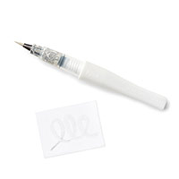
A bit of black heat embossing and watercolouring with an Aquapainter and the card sort of just made itself.

I used a Thank You sentiment from the Tin of Cards stamp set (another set I need to pay more attention to!).  And of course I had to bathe the flowers in my Wink of Stella glitter pen.  I can't quite get enough of my Wink of Stella!  (And I even used a bit of the gold Wink of Stella in the flower centres!)


But I have to tell you - I think my favourite part of this card is the element I discovered when I needed to break up the "white space" at the bottom of the card.

The Tin of Cards stamp set has a few cute motifs that can be added to cards to add visual interest.  
Check out the curlicues at the bottom of this card!  Isn't that linear swooshy-flourish great?!?

Hope you like this card as much as I do.  Tomorrow I will post my club cards for March and trust me, you *really* want to join me for club classes this month!

Until then, have a wonderful weekend and God Bless,    ~Cynthia   <><  


Product List

Tuesday, 8 March 2016

A Quick Hello With Birthday Blooms

Hello My Friends 

This post is for Kathy R.

A dear friend who faithfully and optimistically visits my blog every morning. And who, I fear, I have let down for quite some time now. 

My apologies Kathy. I fear I have been inconsistent with my blogging.   I neglect my blog whenever I feel that I do not have enough time to write substantial descriptions.  Or at least something "worthwhile".   

"Time to write something...?"    Golly, under those conditions, I might never blog again!! 

So here you have a quick blog.  Gorgeous cards - with minimal description, but heartfelt intent and apologies!

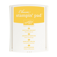
I used the beautiful Birthday Blooms stamp set - embossed with black powder then quickly watercoloured using an aquapainter (with Watermelon Wonder, Calypso Coral and Daffodil Delight ink for the booms, and Old Olive for the leaves).  Nothing fancy.  But gorgeous nonetheless!

Hope you all have a fantastic day.  God Bless,    ~Cynthia   <><  

Product List

Wednesday, 24 February 2016

One For the Guys - Mediterranean Achiever's Blog Hop


Hello My Friends

I'm glad you've decided to join me and some of my very talented friends as we all pitch in to give you One For the Guys.  Many of us struggle a bit more when it's time to create a masculine card.  Not everyone has this hang-up, but it certainly is one of the most common hang-ups I hear my friends say they encounter. So hop along with us and get some ideas to get your masculine mojo going!

You may just be starting the blog hop here (I'm Cynthia Millan) - or may have come from the person previous to me in the list. If you get off track at any time, the full lineup is listed at the bottom.


Now onto my card!


I tried to observe my personal man-rules:
 
No butterflies
No blossoms
No bling
No bows
And no glitter.  

In general, I try to observe these little guidelines and today I definitely did, because this card is all about the designer paper.

The Going Places DSP is PERFECT for masculine cards.  The colours and implied textures are divine!  And the font in the Party With Cake stamp set is just perfect for a guy.  Not fussy.  Not frou frou.  I'd say it works!


The Tiny Triangles embossing folder breaks up the 'white space' on the card and some visual interest is added by raising the vertical banners on dimensionals, but adhering both horizontal banners directly to the layer beneath.   

Tip:  Don't forget, when you are hand-cutting banner pieces that will be layered on top of one another, lay the pieces on top of each other and cut them at the same time so that the angles of the edges match up when you lay them out.  (sounds obvious, I know, but you'd be amazed how often I forget to do this then have to fuss to make my banners match afterwards....)


And did you know what I did - *intentionally* - for the very first time?  I did NOT obsess about using an embossing buddy or clearing all stray bits of embossing powder from the stamped sentiments.  


To be honest, at first I added sentiments onto these cards that were cleaner.  But when I went back and looked at my fuzzier, first attempt, I liked the effect better.  I mean, this card has its own level of pseudo-grunge happening.  So the stray flecks of black embossing powder, along with the vintage font, really works.

I hope you've enjoyed my card.  And don't forget to visit everyone else on the list below.  Hopping is fun and I guarantee you will be inspired by these projects!  And feel free to leave comments whenever and wherever you want.  I can tell you this - bloggers *LIKE* comments!     :)

Have a wonderful, afternoon, evening, morning or whatever!

God Bless,     ~Cynthia     <><

Monday, 27 October 2014

Gentle Peace - How Beautiful It Is!

Hello My Friends

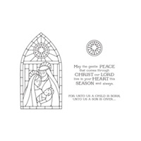
I had a chance to play this weekend with my new favourite stamp set - the Gentle Peace photopolymer stamp that came in my box on Thursday night.  Can I just say - for the record - that I love it.  But I definitely need your help in deciding which direction to take next.

#1 - Orange and Yellow Background
#2 - Background with added Blues

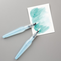
Now most of you know that Gentle Peace was designed to showcase our Stampin' Up! Blendabilities and I have seen some absolutely gorgeous creations on Pinterest, but this weekend I was in a colour-me-fast mood and I didn't want to take the extra time that Blendabilities would need.  So I chose my favourite *fast* method of colouring...using my Aquapainters!

Don't get me wrong, Blendabilities allow you to achieve much more vibrant colours and in truth they do not take 'that' much longer in terms of time...but patience wasn't my strong suit this weekend so I opted for as fast as I could get!

Help me out here friends - first of all, please weigh in on the original 2 images.  Virtually the only difference is the background 'stained glass'.  But I do want to know if you have a preference for one or the other.  So please tell me, #1 or #2.

#2 - Untouched

#3 - Covered With Iridescent Ice

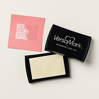
And then....I decided to cover one of the images with versamark and Iridescent Ice since most of you know that has been one of my favourite techniques this Fall.  I was convinced that the shimmer on the image would lend a reality to the stained glass effect.  But now that they are finished, I am not certain one way or the other?

Check out #2 and #3.  Same image, with or without Iridescent Ice.  Hmmm.  Decisions, decisions......

So I mounted my images on cardstock (Bermuda Bay and Blackberry Bliss are such a striking combination, don't you agree?)  Please weigh in your preference for the finished cards....#4 or #5.  I want to know if the iridescent version is a winner before I shimmer up my other versions.  
#4 - Finished Card (no Shimmer)

#5 - Finished Card - Shimmery

I'll pick a name on Friday night and one of the people who comment will be sent the card that they preferred.  So comment please and let me know what you think!

I do have to say, no matter whether the image has been doctored with shimmer or not, it certainly is beautiful.  Serene.  Gentle.  Striking.  I can't wait to play some more.  Check back tomorrow to see what else I have done with it.

Until then, hope you all had a terrific weekend and are looking forward to a great week as well.
God Bless,    ~Cynthia    <><. 


Product List